Intro to Visual Design
Presentation/Training on the Visual Design Troika: Color, Typography, and Layout
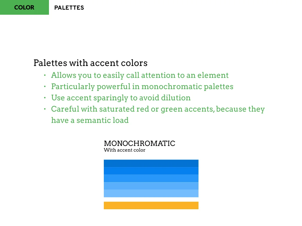
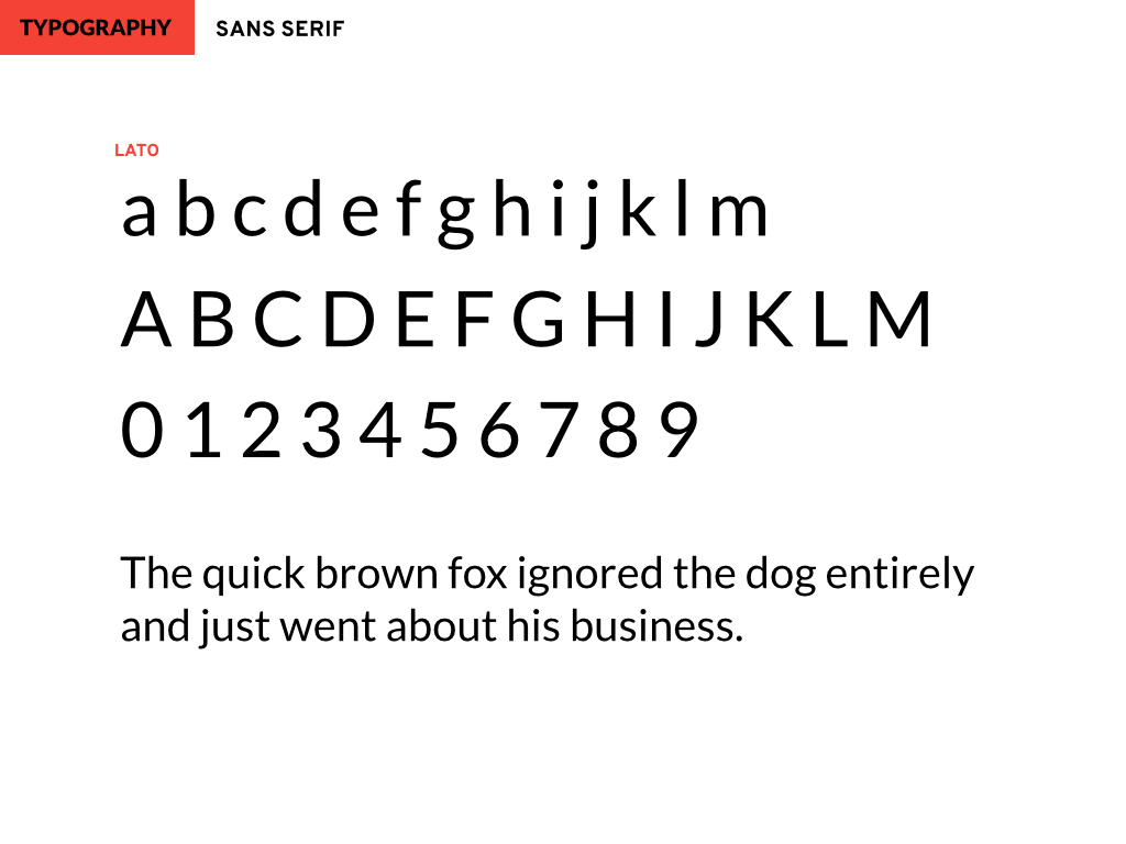
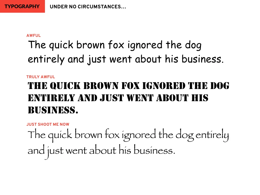
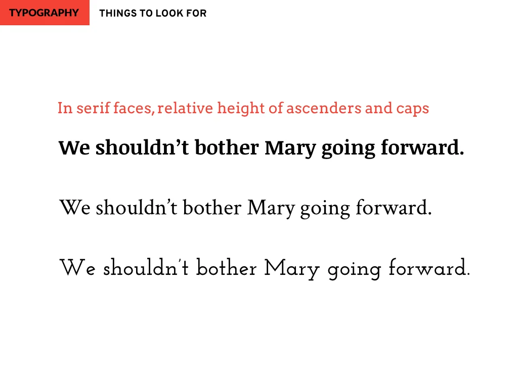
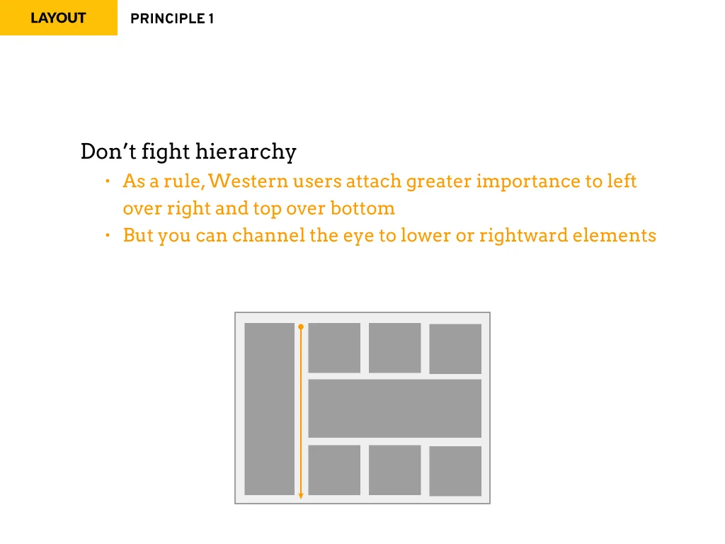
In January 2015, I was asked to train Actuate's sales engineers on basic visual design principles. The point wasn't to turn them into designers — although since many were actively creating prototypes for potential and current customers, we hoped we could elevate the quality of that work. The real purpose was to help our sales force better understand the expectations of increasingly design-savvy customers, many of whom had in-house design teams whose concerns could make or break a sale.
Putting together a 3-hour presentation was a lot of work but it was also a real learning experience for me. It made me really sit down and think critically about my personal design philosophy.
It also taught me an important lesson: check the quality of projection equipment before you embark on such a presentation. The projector provided had a heavy green-shift, rendering most colors dank and muddy. It's a real low point when first question from the audience is "So, is everything these days supposed to be brown? Is that a design thing?" [face palm]

